Designing for a good user experience at the enterprise level can be an exercise in frustation. Our company still runs so many things using Excel spreadsheets. No web application or PowerBI report was complete unless it could export to Excel. It was so maddening that I wrote a Medium article about it....
Breaking the Excel Barrier
Breaking the Excel Barrier
Over the years I've tried many solutions to get the enterprise user comfortable with data not shown in a spreadsheet, but on a dashboard....with color coding.
I've used mechanism to switch between an abstracted color coded display, and the supporting data.
I've used automated mechanisms, that will fast forward to a particular cell in a huge data table, that highlights individual cells based on the user own habits in filtering/sorting/etc.
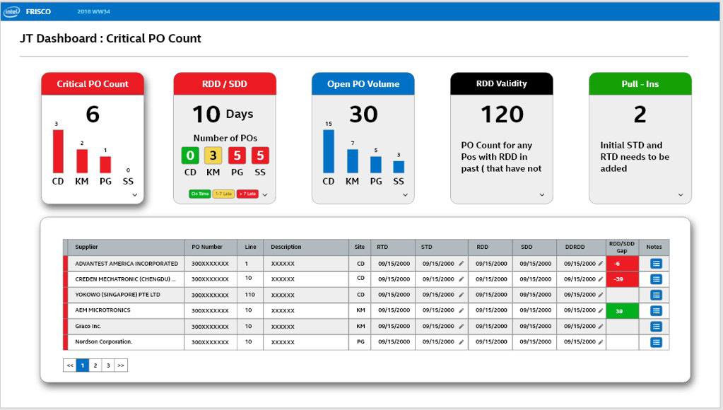
I am finally getting some traction. The dashboard below was designed and implemented for an individual user. I worked directly with him and crafted exactly what he wanted to see. I let him set the triggers and colors and still showed him the data that supports the tiled indicators. In fact, if he clicks an indicator tile, it filters the table to the data that was used to set the indicator. The next version will allow him to edit/define the logic and triggers for each tile himself. I am waiting for the day when he wants the table real-estate repurposed for another row of tiles.
There is no Export to Excel, and he has not asked..... shhhhh.
I've used mechanism to switch between an abstracted color coded display, and the supporting data.
I've used automated mechanisms, that will fast forward to a particular cell in a huge data table, that highlights individual cells based on the user own habits in filtering/sorting/etc.
I am finally getting some traction. The dashboard below was designed and implemented for an individual user. I worked directly with him and crafted exactly what he wanted to see. I let him set the triggers and colors and still showed him the data that supports the tiled indicators. In fact, if he clicks an indicator tile, it filters the table to the data that was used to set the indicator. The next version will allow him to edit/define the logic and triggers for each tile himself. I am waiting for the day when he wants the table real-estate repurposed for another row of tiles.
There is no Export to Excel, and he has not asked..... shhhhh.