My discovery of Design Systems, opened my eyes to the reusability of tested and proven components and patterns. One of my first exposures to this was through a component library, published by the IT department of my company. It was published via a nice reference website, with a downloadable CSS file, and copious examples of the elements that I could use in my team's web applications. I immediately began using this as I recognized the utility of such a system. I used the styles and examples to create a UI kit for Adobe XD, which made my mockup creation process much more efficient, and brought my design in closer harmony to the end product.
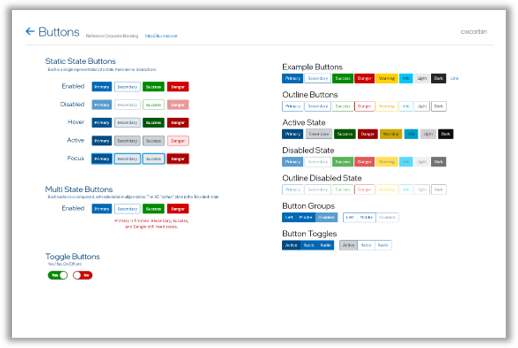
The original component library was modelled heavily on Bootstrap, even using the default color palette. I quickly updated those using the corporation's branding guidance. That guidance was created specifically for marketing purposes, so I integrated the color palette into the UI kit, so that the created application's would be in harmony with the company's brand guidance.
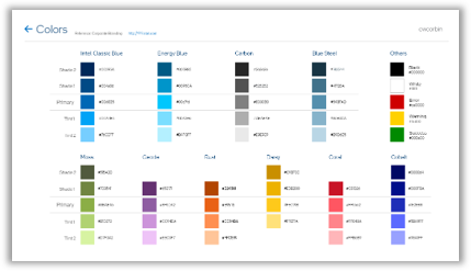
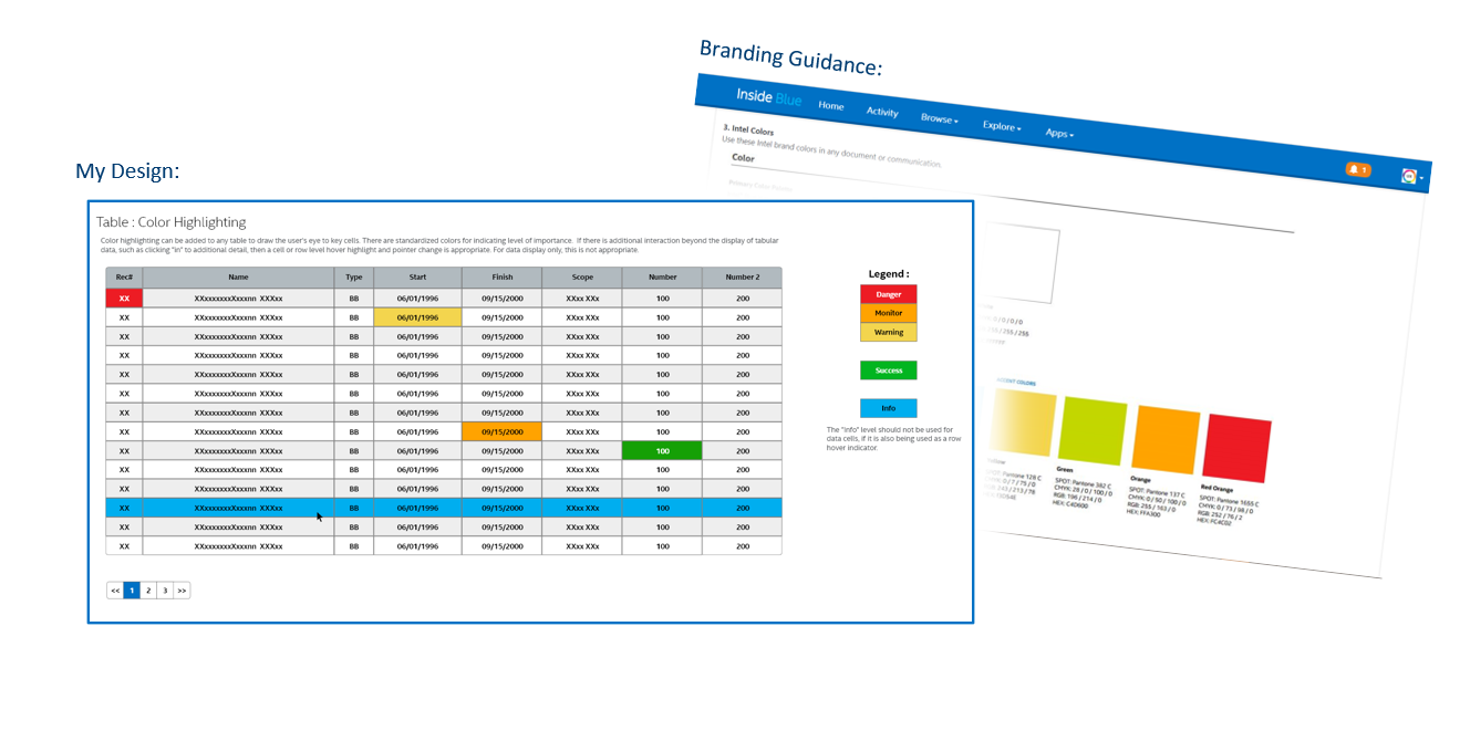
One of the earlier colors prescribed in the original corporate palette, was this weird green color. You can see it in the far right of the image. I saw the need for clear and fully saturated colors to convey "statuses", what we now call the "Stoplight" colors, red/yellow/green. I updated my color guidance to include fully saturated colors that clearly represent these statuses. You can see "that green" on the far right, and the fully saturated green I chose for conveying "success" or "ok" in the table on the left.
Much clearer.
Much clearer.
Sadly, this corporation was heavily silo'ed, with many divisions ignoring the corporate color palette, and developing their own widely varying styles. Every custom application looked different, there was no harmony.
So I began to evangelize the need for a corporate level design system, in an attempt to bring cohesion to all internally developed custom software. I first targeted the Sales and Marketing division, as they were the folks who had commissioned and published the corporate branding guidance previously mentioned. I believed that a corporate Design System should live alongside the branding guidance, and clarify its application for user interfaces. They were interested, but could not resource the effort. Swing and a miss. So I networked. And networked some more. I found a few interested folks, and began tracking conversations, and categorizing folks as "interested" or as "champions", I started an organization chart that kept track of these folks and their connections.
What I needed was a VP or C-Suite executive to sponsor the effort. In a silo'ed corporation, getting a sponsor at that high level breaks down divisional walls, and enables adoption across divisions. It brings legitimacy and governance...
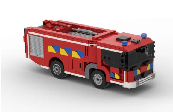
Over two years I gained traction. I was connected to within one level of my first VP. I started prepping my elevator pitch. This is where those previously mentioned Firetrucks join the story...
I was looking for an analogy that could quickly convey the efficiency a Design System could add to the software engineering process. The Legos system provided the answer. A system that is engineered to work together, tested and proven, that allows for nearly unlimited creativity, with snap together components. Perfect. I even wrote a Medium article about it.... "Design Systems and Fire Trucks."
Click the Firetruck picture to read the article.
The pitch went well, and I was invited to schedule for a later date to discuss staffing and funding. I was over the moon! Sadly, after two years of effort, a company re-organization disrupted all in-flight initiatives and my VP moved to another division.
Down in flames.
( This story continues in "Design Systems ( Round 2 )
Down in flames.
( This story continues in "Design Systems ( Round 2 )