
Currently I am a UX Team of One ( with regards to Leah Buley ), and am serving a dual role as the Product Owner for the enterprise web application the team is building. I have around 20 developers, 5 Program Managers, and a ScrumMaster.
I am drunk with UX power.
I have freedom to design, and the resources to bring it to life. But wearing both hats is not all sugar and spice. I still need to deliver a feature set, good app performance, and clean up a gargantuan amount of technical debt as we go. Sobering.
(There were around 120 CSS files in the solution. Gad.)
So I took the most efficient path I could with regards to creating a style guide. I chose to begin with the latest Bootstrap version and an override file. That's right, a UX Designer chose to go with a ready-made solution. As much as I wanted to indulge my design-side, designing and testing.... my product owner hat made the decision for me. Bootstrap is a very mature system, tested in the real world, and easily customized. It made sense.
I quickly established a direction for the design guidelines and got them published. I immediately put a developer on the refactoring of the myriad CSS files, down to just the two. I assigned developers to address performance issues.... and I talked to the users!
I quickly established a direction for the design guidelines and got them published. I immediately put a developer on the refactoring of the myriad CSS files, down to just the two. I assigned developers to address performance issues.... and I talked to the users!

My design side did get some attention though. Remember the corporate guidance mentioned in the first Design System article? I used the color palette from the corporate guidance for the overrides. Buttons were first. The main company color, became the default color for the primary action buttons. I didn't need reams of documentation, or bureaucracy. The developer added the directives to the override file, published the properly formed code snippet to the team, and we were off!
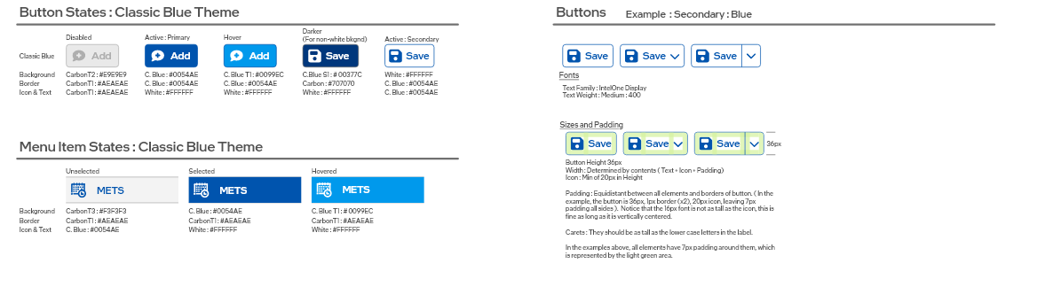
I did take the time to build out a design guide for the default blue color (above). I created a quick page in Adobe XD, and had the override file edited to support the strategy.
XD is my preferred design tool, and I hope it continues to be supported by Adobe....
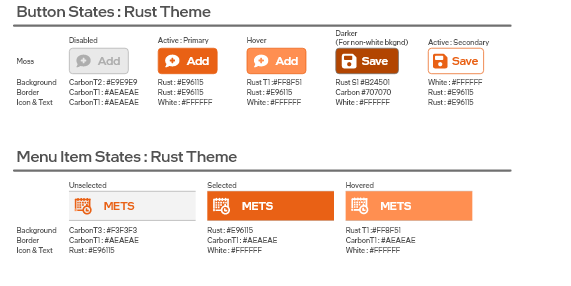
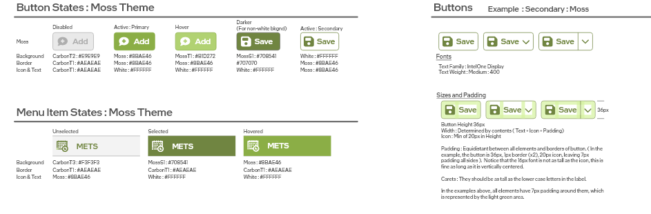
I quickly followed up the default blue colors, with some colors deeper in the corporate guidance. Originally intended as accent colors, they became the primary colors for applications in other domains of the suite. They brought instant recognition, through color cues, of where the user is at within the suite. ( There are ~50 applications within the larger suite, so visual cues were helpful. )
XD is my preferred design tool, and I hope it continues to be supported by Adobe....
I quickly followed up the default blue colors, with some colors deeper in the corporate guidance. Originally intended as accent colors, they became the primary colors for applications in other domains of the suite. They brought instant recognition, through color cues, of where the user is at within the suite. ( There are ~50 applications within the larger suite, so visual cues were helpful. )
This story is still developing, as it is my current role. Once we have satisfied the deliverables for my Product Owner role, there is a definite need for me to put the UX hat back on. That should happen after my return from sabbatical, and am I ever looking forward to it.
Stay Tuned.
Stay Tuned.